
The bar chart is probably the most commonly used type of graph and this post talks about what kind of data this works well for. In this post I’ll talk about using bar charts to compare various products and geographies but for one fact and one time period. This is part of a series of posts on using graphs to make your analysis come alive. Learn about the pie chart and its relative the stacked bar chart in previous posts.
But before I get to that…click on this link to see how graphs can be used to illustrate things outside of business.
Compare Products
It is very common to show things like distribution, price or merchandising across brands (or some other product aggregation). Take a look at some simple distribution data: 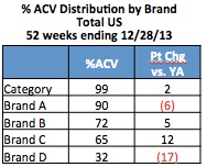
Looking at a bar chart allows you to easily see that Brand A is in much higher distribution than the other brands and that Brand D is clearly lagging. Brands B and C have fairly similar distribution.
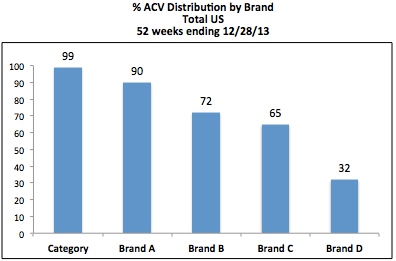
It can also be helpful to use a bar chart to show not just the level of something, but also the change vs. year ago, like this:
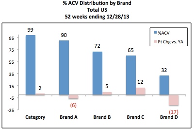
On this one chart you can see how distribution stacks up between brands, who’s up and who’s down and the magnitude of those changes.
Compare Geographies
It is also common to show something across geographies in one time period, like the variation in share in markets across the country:
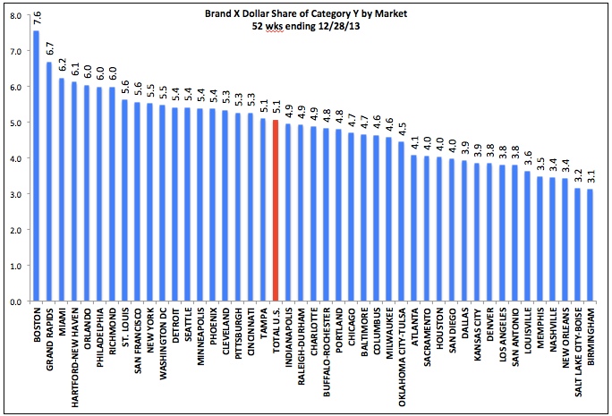
It is usually a good idea to sort the geographies so it is easy to see the high and low values. In this example I’ve sorted Total US along with all the markets but then shaded it a different color so it can be seen. As an alternative, you could put Total US as the first bar on the left, which also makes it easy to see how all the markets compare to the national average.
Compare Multiple Products and Multiple Geographies
Sometimes a bar chart is a good way to efficiently show multiple products and geographies. It is important for you to know the most important takeaways you want to emphasize with the graph, as this will determine how to best display the data.
Take a look at the following data showing pricing for two sizes of two brands in Grocery vs. Walmart:
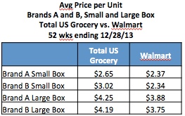
Marketing may want to look at the data within channels when determining the overall pricing strategy – relative price between sizes for your brand and where you want to be vs. a key competitor.
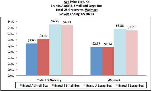
Key takeaways for Brand Manager of Brand A:
- The relationship between sizes and brands are fairly similar in Grocery and Walmart.
- Assuming Brand A’s strategy is to be slightly higher priced than Brand B, then there is an opportunity to adjust pricing (upward) on the small size in Grocery.
The Sales Team that calls on Walmart (or Trade Marketing) may want to compare pricing in Walmart and Grocery for each pack size to make sure that the desired gap between channels is being maintained.
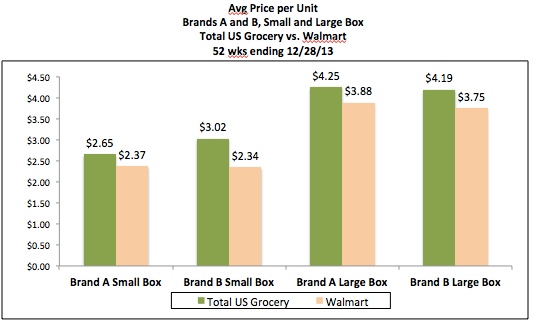
Key takeaways for Walmart Sales Team for Brand A:
- For Brand A, both sizes are priced about 10% lower in Walmart than in Grocery – the small size is 28¢ (10.6%) lower and the large size is 37¢ (9.5%) lower.
- The difference in pricing between Grocery and Walmart is similar for the large size of Brand B but much wider for the small size (10.5% for the large size vs. 22.5% for the small size).
Notice how even a simple charting choice like how the data is grouped can have a big impact on visual communication. In the first chart, grouping by channel makes the brand comparison pop visually. In the second chart, grouping by product vividly illustrates the channel differences. Charting can play a role in your analysis and your communication. Adjusting how data is displayed in a chart can help you uncover interesting findings. Then, once you decide which key points you want to share with your audience, your charting choices should be driven by which format most effectively drives home those conclusions.
Did you find this article useful? Subscribe to CPG Data Tip Sheet to get future posts delivered to your email in-box. We publish articles once a month. We will not share your email address with anyone.

Leave a Reply