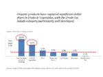
We analysts love nothing better than digging through piles of data. But, when it comes to communicating our insights, less is more. Note: In this article, I focus on charts in the form of slides but many of my design recommendations would also apply to dashboards or more complex visualizations. To increase the odds of […]
visualization
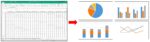
Visualization: A Picture Is Worth A Thousand Numbers
Visualization (or visualization in some places) is one of the hottest topics around lately. In fact, I just Googled both spellings and got 191 million hits for the American spelling with a “z”) and 43.4 million hits for the British spelling! Here’s what Wikipedia has to say: “Visualization (or visualisation) is any technique for creating images, diagrams, or animations to […]
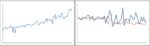
Picture This: Time After Time, The Line Chart
One of the most powerful graphs is the line chart. Line charts allow you to: Decode underlying trends over time Compare trends for different products or markets Explore relationships between different measures In addition to making it easier to see trends, you will typically use a line graph because there’s just too much data to […]
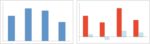
Picture This: Bar Chart, The Go-To Graph
The bar chart is probably the most commonly used type of graph and this post talks about what kind of data this works well for. In this post I’ll talk about using bar charts to compare various products and geographies but for one fact and one time period. This is part of a series of […]
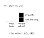
Picture This: Famous Movie Quotes!
Here’s something fun that I came across this week, as movies were in the news due to the announcement of Oscar nominations: Click here to see Famous Movie Quotes as Charts, from the website Flowingdata.com (January 16, 2014). Note the wide variety of graph types used! This shows that you don’t have to have numerical data […]
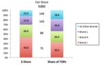
Picture This: Stacked Bar Chart, Cousin of the Pie Chart
As mentioned in a previous post, how you present your analysis is at least as important as the numbers themselves. Using the right graphs is an essential element that helps you tell a story with your data, rather than just report a bunch of numbers. In this older post I talked about market share and […]