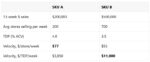

We’ve written before about why Sales per Store per Week ($PSPW or UPSPW) can be a flawed velocity measure. Our primer on this topic explains the problem. For example, a Walmart store and a 7-Eleven store each count as one store, so per-store velocity is biased toward items sitting in big box retail, since larger-format […]
How To Communicate Insights
The Product Mix Trap: Why Averages Can Lie in CPG
I want to wholeheartedly thank Robin and Sally for trusting me as the new steward of the incredible CPG Data Tip Sheet. As they mentioned in their post last week, the site truly helped me get up to speed on CPG analytics, fundamentals, and terminology when I started my career at Nielsen over a decade […]
More On Panel Data + Shopping Behavior During the COVID-19 Pandemic
Recently, I wrote about a Nielsen chart illustrating consumer behavior in the U.S. during the COVID-19 pandemic. In this post, I’ll show these same metrics from another panel provider: Numerator. Numerator (formerly known as InfoScout) gathers their panel data by having panelists take photos of physical receipts and provide access to their e-receipts. That’s a […]
A Panel Data Case Study: Shopper Behavior During COVID-19
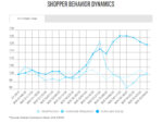
As I shared recently, there is a wealth of free, public information coming out from data providers on consumer behavior during these crazy times. In this post, I’ll highlight, explain, and critique a chart published by Nielsen. Next week, I’ll share a similar chart from Numerator. Taking it back a step, what is panel data? […]
20 Golden Rules to Help You Shine As An Analyst
I was recently purging some old files. I found a long-buried gem, from my IRI days, that I want to share with you. These words of wisdom came from my all-star manager, Linda Abraham. Linda went on to co-found Comscore and is now an investor and advisor to tech companies. Note: when Linda crafted her […]
How to Be Convincing: Three Rules for Creating Persuasive Charts
We analysts love nothing better than digging through piles of data. But, when it comes to communicating our insights, less is more. Note: In this article, I focus on charts in the form of slides but many of my design recommendations would also apply to dashboards or more complex visualizations. To increase the odds of […]