
Recently, I wrote about a Nielsen chart illustrating consumer behavior in the U.S. during the COVID-19 pandemic. In this post, I’ll show these same metrics from another panel provider: Numerator. Numerator (formerly known as InfoScout) gathers their panel data by having panelists take photos of physical receipts and provide access to their e-receipts. That’s a […]
visualizations
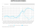
A Panel Data Case Study: Shopper Behavior During COVID-19
As I shared recently, there is a wealth of free, public information coming out from data providers on consumer behavior during these crazy times. In this post, I’ll highlight, explain, and critique a chart published by Nielsen. Next week, I’ll share a similar chart from Numerator. Taking it back a step, what is panel data? […]
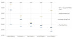
3 Ways to Kickstart Pricing Discussions with Visualizations
We’re delighted to have guest contributor Scott Sanders, share his expertise with CPG Data Tip Sheet readers. Scott’s contact details can be found at the end of this article. Of the four Ps of marketing, price has the most power to transform a company’s revenue and profit. The best way to kickstart a pricing discussion is […]