• Skip to primary navigation
  • Skip to main content
  • Skip to primary sidebar
  • Skip to footer

CPG Data Tip Sheet

Transforming your syndicated data into business insight

  • Home
  • Glossary
  • About Robin Simon
  • About Sally Martin
  • Contact
Blog » How To Communicate Insights » Visualization: A Picture Is Worth A Thousand Numbers

Visualization: A Picture Is Worth A Thousand Numbers

October 3, 2018 By Robin Simon Leave a Comment

Print Friendly, PDF & Email

Visualization (or visualization in some places) is one of the hottest topics around lately.  In fact, I just Googled both spellings and got 191 million hits for the American spelling with a “z”) and 43.4 million hits for the British spelling!

Here’s what Wikipedia has to say:
“Visualization (or visualisation) is any technique for creating images, diagrams, or animations to communicate a message. Visualization through visual imagery has been an effective way to communicate both abstract and concrete ideas since the dawn of humanity. Examples from history include cave paintings, Egyptian hieroglyphs, Greek geometry, and Leonardo da Vinci‘s revolutionary methods of technical drawing for engineering and scientific purposes.”

In this current era of Big Data, Analytics and all things data-related it is very easy to confuse your audience rather than inform them.  Fortunately, CPG Data Tip Sheet has published several handy posts on the most useful kinds of visualizations (formerly known as “graphs”), along with use cases for each one (formerly known as “examples of when to use”).

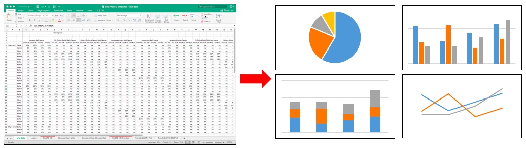
  • The Pie chart is used to show shares, things that add up to 100%. (The Donut chart has replaced this in many uses but we are still partial to the good old pie.)
  • The Line chart is used to show trends over time.
  • The Bar chart is probably the most commonly used and can be shown vertically or horizontally.
  • The Stacked Bar chart is related to the Pie chart and show two different things that add up to 100% on the same graph.  It’s hard to compare one pie chart to another so a stacked bar is often the better choice when analyzing share change over time or when comparing one measure of share to another.

And just for fun, click here for some clever visualizations related to…the movies!

Is your favorite graph type missing from this post?  Feel free to give it a shout-out and why you like it in the comments below.

Did you find this article useful? Subscribe to CPG Data Tip Sheet to get future posts delivered to your email in-box. We publish articles once a month. We will not share your email address with anyone.

Share
Tweet
Share

Filed Under: How To Communicate Insights Tagged With: charts, graphs, visualization

Reader Interactions

Leave a Reply Cancel reply

Your email address will not be published. Required fields are marked *

This site uses Akismet to reduce spam. Learn how your comment data is processed.

Primary Sidebar

Top Posts

  • The 2nd Most Important Measure: % ACV Distribution
  • Velocity: How Well Your Product REALLY Sells
  • Total Distribution Points: Master of All Distribution Measures
  • xAOC and MULO: Multi-Channel Markets in Nielsen & IRI
  • The Beginner’s Guide to Trade Merchandising Measurement

Search CPG Data Tip Sheet

Subscribe to New Posts

Get new posts delivered straight to your inbox. We won't share your email address with anyone.

Thank you for subscribing!

Subscribe

About CPG Data Tip Sheet

We (Sally Martin and Robin Simon) first met in business school and bonded over our interest in geeky marketing stuff. Eventually we both started independent consulting practices. Now we’ve reunited to share with you some of what we’ve learned in our decades of experience working with syndicated CPG data.

Categories

  • Glossary (79)
  • How To Answer Business Questions (42)
  • How To Communicate Insights (17)
  • How To Get Started with Nielsen/IRI (22)
  • How To Understand Your Database (12)
  • Know Your Measures: Distribution (24)
  • Know Your Measures: Pricing and Promotion (45)
  • Know Your Measures: Sales (21)
  • Miscellaneous (6)

Tags

ACV analysis examples analytic skills attributes average items base base weighted weeks career development category management channels characteristics coronavirus coverage factor covid-19 Database distribution due-to Excel tips Facts incremental markets Measures merchandising new items panel data periods pricing pricing strategy products promoted price quantify opportunity retailer direct data retailer markets shopper data store data Syndicated TDP the basics trade promotion trading areas velocity visualization visualizations volume bridge volume decomposition

Footer

Categories

  • Glossary (79)
  • How To Answer Business Questions (42)
  • How To Communicate Insights (17)
  • How To Get Started with Nielsen/IRI (22)
  • How To Understand Your Database (12)
  • Know Your Measures: Distribution (24)
  • Know Your Measures: Pricing and Promotion (45)
  • Know Your Measures: Sales (21)
  • Miscellaneous (6)

Search CPG Data Tip Sheet

Tags

ACV analysis examples analytic skills attributes average items base base weighted weeks career development category management channels characteristics coronavirus coverage factor covid-19 Database distribution due-to Excel tips Facts incremental markets Measures merchandising new items panel data periods pricing pricing strategy products promoted price quantify opportunity retailer direct data retailer markets shopper data store data Syndicated TDP the basics trade promotion trading areas velocity visualization visualizations volume bridge volume decomposition

Terms of Use | Copyright © 2025 CPG Data Insights · Log in