
As I shared recently, there is a wealth of free, public information coming out from data providers on consumer behavior during these crazy times. In this post, I’ll highlight, explain, and critique a chart published by Nielsen. Next week, I’ll share a similar chart from Numerator.
Taking it back a step, what is panel data? I define it as any information source that tracks behavior over time by gathering data directly from individual shoppers. A detailed article on panel data, and how it differs from store sales data, can be found here.
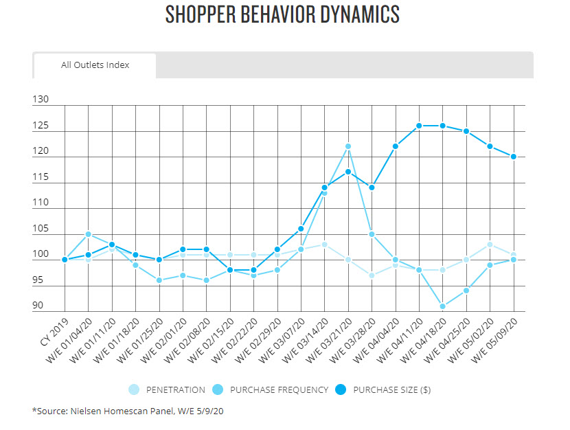
CPG/FMCG sales are up dramatically as the U.S. population stays home to eat, work, and relax. But what else can we say about how shopping behavior has changed? In the chart below, which I pulled from Nielsen’s U.S. COVID-19 insights page, Nielsen uses their Homescan panel to illustrate the underlying shifts in Americans’ buying behavior. Nielsen’s panel is based on a representative sample of households who use in-home scanning devices to record all their purchases. Update: this post originally linked to the Nielsen COVID-19 data and charts discussed here but that data is no longer available on Nielsen’s website.
Anatomy of the Chart
In this chart, Nielsen is combining all the tracked outlets/channels. It’s always important to note the geography before you start scrutinizing the data.
A typical panel data analysis will decompose total sales into three pieces, and that’s what Nielsen does here.
- How many shoppers did you have? In this chart, Nielsen tracks the common metric “penetration” which is % of households buying.
- How often did they buy? In this chart, Nielsen calls this “purchase frequency.”
- How big was their purchase? In this chart, Nielsen calls this “purchase size” and measures it in dollars.
The three raw panel metrics are not shown. Instead, Nielsen shares changes in the measures relative to last year. They are indexing each current week to the whole of calendar 2019. You can think of an index of 110 as equivalent to 10% increase versus the average week year-ago; an index of 90 is comparable to -10% decline versus the average week year-ago.
Nielsen’s X-axis is weeks (“w/e” means week ending). They communicate their indexing approach (somewhat cryptically IMO) by having the first “week” be CY2019 (calendar year 2019) with a value of 100. Kudos to Nielsen for timeliness! This chart shows data through 5/9 and is being updated weekly about 10 days after the data end date.
IMHO, Nielsen could have been clearer about their indexing approach (that they are comparing each current week to all of 2019) in their chart title or in a footnote. They also should have picked colors that are more distinct from each other. Color choice is my biggest complaint. I also don’t love the gridlines (distracting) but it does make it easier to guesstimate the actual numbers. Want more of my opinions about charting?
What’s the Chart Saying
OK, enough of my charting quibbles. On to what the data is communicating re COVID-19 behavior…
Penetration (the lightest dot) hasn’t changed that much versus year-ago. Nielsen’s chart includes all products across all channels so that is not surprising – all households bought FMCG products somewhere before and they are still buying them now.
Purchase frequency (medium blue) and purchase size (dark blue) is where the behavior changes lie. Both were on the rise in March (indices growing above 100 for several weeks) as everyone loaded up due to some combination of serious pantry loading, intense stock up, or somewhat irrational hoarding, depending on the household and the product category. In April, purchase frequency fell to below year-ago levels (but not that far below – indices still between 90 and 100) while purchase size continued to rise. In May, as states begin to reopen, purchase frequency is heading back to normal levels while purchase size remains high but may be starting to decline.
Thank you Nielsen for your insightful chart and for updating it in such a timely fashion!
See all our panel data articles here.
Is the index chart comparing the same week this year vs last year or is it comparing this year’s weekly results to the calendar year 2019 weekly average? Seems like the latter. Which makes the format make sense.
Yes! Thank you for this – I’m editing my original post to reflect your comment.