• Skip to primary navigation
  • Skip to main content
  • Skip to primary sidebar
  • Skip to footer

CPG Data Tip Sheet

Transforming your syndicated data into business insight

  • Home
  • Glossary
  • About Robin Simon
  • About Sally Martin
  • Contact
Blog » How To Communicate Insights » Picture This: Market Share

Picture This: Market Share

November 11, 2013 By Robin Simon 3 Comments

Print Friendly, PDF & Email

generic pie cht


How you present your analysis is at least as important as the numbers themselves.


One of the most basic measures to gauge how well your business is doing is share, what portion of category sales your brand accounts for.  Of course, higher is better and the sum of shares for all brands in the category has to equal 100.  Take a look at the following table:

alphabetical share

If the brands are listed in alphabetical order, it is not always easy to immediately see who is the biggest and smallest and where the other brands fall in between.  One way to improve the table is to sort the brands in descending order.  Now you can quickly see the order but, aside from the fact that Brands E and A have higher share than the other brands, the relative sizes are not obvious.

sorted share

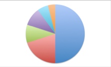
Usually the best way to show share is in a pie chart:

mkt share pie

Now it is easier to see the relative size of all the brands and how they compare to each other.  The pie also lets you know that all the brands in the graph make up 100% of the category.  (If you use a bar or column chart instead of a pie, the reader has to add up all the shares in the chart to see if the sum of the shares shown is 100, that all brands are being shown.)

Too Many Brands?

If there are LOTS of brands in the category, as in way too many to look nice in a pie chart, then you can show the top, say, 5 or 6 brands and create an aggregate for “All Other Brands.”  It’s a good idea to indicate how many brands are making up the All Other.

all other share pie

If your brand is one of the small ones that falls into All Other Brands, then you can still show a slice of the pie for your brand and just add up all the remaining brands, which can still be called All Other Brands.

Keep in mind that you can also use a pie chart to show other kinds of share, like share of distribution or share of merchandising.  Whenever everything you’re showing adds up to 100%, a pie chart is the way to go.

Have other questions about what’s the best graph to use?  Look for future posts on comparing prices, trending over time and other topics related to showing your data in a visually compelling way.  Feel free to leave a Comment for this post.

Did you find this article useful? Subscribe to CPG Data Tip Sheet to get future posts delivered to your email in-box. We publish articles once a month. We will not share your email address with anyone.

Share8
Tweet
Share

Filed Under: How To Communicate Insights Tagged With: market share, pie chart, visualization

Reader Interactions

Comments

  1. Mark Olivito says

    November 12, 2013 at 6:41 am

    Great article, one of those fundamental metrics that get overlooked. I think market share should be a “5th P” of marketing, called “Power!”

    Reply
  2. Spencer Millerberg says

    November 12, 2013 at 10:52 am

    Kudos to you Robin! Great article.
    One add… pie charts are great for snap shots, but to gain understanding of changes over time, line graphs give you a better view of longitudinal data.
    For those who want to understand their market share at Amazon.com, visit us at http://www.oneclickretail.com.

    Reply
  3. Robin Simon says

    November 14, 2013 at 4:53 pm

    Thanks, Mark and Spencer!
    You are right that a line graph is used to show trends over time – I will be doing a future post on that. I will also cover other types of graphs in the future.

    Reply

Leave a Reply Cancel reply

Your email address will not be published. Required fields are marked *

This site uses Akismet to reduce spam. Learn how your comment data is processed.

Primary Sidebar

Top Posts

  • The 2nd Most Important Measure: % ACV Distribution
  • Velocity: How Well Your Product REALLY Sells
  • Total Distribution Points: Master of All Distribution Measures
  • xAOC and MULO: Multi-Channel Markets in Nielsen & IRI
  • The Beginner’s Guide to Trade Merchandising Measurement

Search CPG Data Tip Sheet

Subscribe to New Posts

Get new posts delivered straight to your inbox. We won't share your email address with anyone.

Thank you for subscribing!

Subscribe

About CPG Data Tip Sheet

We (Sally Martin and Robin Simon) first met in business school and bonded over our interest in geeky marketing stuff. Eventually we both started independent consulting practices. Now we’ve reunited to share with you some of what we’ve learned in our decades of experience working with syndicated CPG data.

Categories

  • Glossary (79)
  • How To Answer Business Questions (42)
  • How To Communicate Insights (17)
  • How To Get Started with Nielsen/IRI (22)
  • How To Understand Your Database (12)
  • Know Your Measures: Distribution (24)
  • Know Your Measures: Pricing and Promotion (45)
  • Know Your Measures: Sales (21)
  • Miscellaneous (6)

Tags

ACV analysis examples analytic skills attributes average items base base weighted weeks career development category management channels characteristics coronavirus coverage factor covid-19 Database distribution due-to Excel tips Facts incremental markets Measures merchandising new items panel data periods pricing pricing strategy products promoted price quantify opportunity retailer direct data retailer markets shopper data store data Syndicated TDP the basics trade promotion trading areas velocity visualization visualizations volume bridge volume decomposition

Footer

Categories

  • Glossary (79)
  • How To Answer Business Questions (42)
  • How To Communicate Insights (17)
  • How To Get Started with Nielsen/IRI (22)
  • How To Understand Your Database (12)
  • Know Your Measures: Distribution (24)
  • Know Your Measures: Pricing and Promotion (45)
  • Know Your Measures: Sales (21)
  • Miscellaneous (6)

Search CPG Data Tip Sheet

Tags

ACV analysis examples analytic skills attributes average items base base weighted weeks career development category management channels characteristics coronavirus coverage factor covid-19 Database distribution due-to Excel tips Facts incremental markets Measures merchandising new items panel data periods pricing pricing strategy products promoted price quantify opportunity retailer direct data retailer markets shopper data store data Syndicated TDP the basics trade promotion trading areas velocity visualization visualizations volume bridge volume decomposition

Terms of Use | Copyright © 2025 CPG Data Insights · Log in