
We’ve written before about why Sales per Store per Week ($PSPW or UPSPW) can be a flawed velocity measure. Our primer on this topic explains the problem. For example, a Walmart store and a 7-Eleven store each count as one store, so per-store velocity is biased toward items sitting in big box retail, since larger-format stores have more foot traffic. The standard fix is an ACV-weighted or TDP denominator, and sales per point of distribution has generally been our recommended measure between the two.
That advice still holds, but there’s a second half to the lesson that comes up constantly in real category work, and it cuts the other way. What we mean is that ACV weighting can have a bias too. So, when the two velocity measures disagree about which item is “winning,” and they often do, the disagreement itself is telling us something useful.
A tale of two SKUs
Here’s a simplified example from a recent spirits brand performance review (numbers rounded and anonymized).
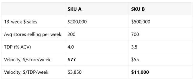
SKU A wins on dollars per store by a wide margin ($77 to $55)…
… but SKU B wins on dollars per TDP by nearly 3x.
So, again we have the same data, yet opposite conclusions.
The tell is hiding in plain sight
But let’s divide TDP by store count…
SKU A carries 4.0 points of ACV (or 4 TDPs) across just 200 stores.
SKU B carries 3.5 points across 700 stores.
Per 1,000 stores, that’s 20 points for SKU A and 5 points for SKU B.
So, this ratio (TDP / Store Count) is a proxy for the average size of the stores each item sits in.
An item racking up lots of ACV points in few stores is typically sitting in big box stores. SKU A’s profile (few stores, heavy ACV per store) can mean a chain authorization, for example, while SKU B’s profile likely means broader distribution across smaller-format stores… think independents, smaller grocery, etc.
ACV weighting has an assumption too
Our primer’s critique of using per-store velocity is that it treats all stores as equal, and ACV weighting fixes that. It’s true. However, the subtlety is that every denominator still carries an assumption. The assumption applying to ACV weighting is that an item should sell in proportion to a store’s total volume. But a store’s total volume is mostly not your category. A supercenter’s ACV is dominated by groceries, and its spirits shelf isn’t proportionally huge. Meanwhile a small liquor store has tiny ACV but the category punches far above the store’s total volume.
So, dollars per ACV or TDP can systematically penalize items distributed in larger-format stores and flatter items concentrated in smaller-format ones. In the example above, that’s exactly what’s happening.
SKU A’s big stores generate big per-store dollars, but relative to the enormous ACV flowing through them, it’s actually under-selling.
Meanwhile, SKU B’s smaller stores suppress its per-store number while the TDP or ACV-weighted view makes it look like a star workhorse.
A quick word on Sales per $MM ACV, which we’ve recommended before for comparing velocity across markets. That recommendation stands, and for cross-market work it remains the right tool… a point of ACV means very different dollars in Total US Food than in a single retailer, while a million dollars of ACV means the same thing everywhere. Just know that within a single market, it behaves identically to sales per point of distribution. A point of distribution is a fixed slice of that market’s ACV dollars, so the two measures differ only by a constant. Same ranking, same store-size lean. The store-size question in this post is simply a separate issue from the cross-market question that measure was built to solve.
5 ways to deal with potential weighted distribution bias
1. Narrow the market to a single retailer when the question allows it. This is the cleanest fix because it removes the problem entirely instead of correcting for it. Within one banner, store formats are broadly similar. It’s also the comparison that matters most in practice, because the highest-stakes velocity claim is usually made to a specific retailer’s buyer, who cares about performance in their stores rather than in a blended universe where a competitor’s number may be propped up by a channel that buyer doesn’t even operate in… like grocery vs mass or convenience. Two honest caveats, though. First, same retailer isn’t quite the same as same stores… an item in 25% of the chain’s doors is probably in the better locations, so narrow distribution still experiences a mild selection bias that only store-level data can fully remove. Second, this “fix” works by essentially removing the question entirely, so it tells you who wins in that banner but in doing so drops every competitor who isn’t actually there.
2. Cut by channel when the question is bigger than one retailer. The ideal denominator weights each store by its volume in your category rather than its total volume or ACV. NielsenIQ calls it PCV (Product Class Value) weighted distribution and defines it right alongside ACV weighting in their own public educational materials. In practice, though, it rarely shows up in the standard US extracts most of us work from (at least in our experience) which ship %ACV and TDP. So, it’s worth asking your provider whether your contract can include it, and if it can, lead with it. But when it isn’t available, the workable substitute is comparing within channel. Most of the store-size distortion comes from mixing channels in one universe, because shopping behavior and resulting foot traffic for your category may be very different in a supercenter than in a liquor store which an ACV or TDP weighting alone can’t solve for. If you run the same ranking separately in Food, in Liquor, in Convenience, etc. then most of the bias can fall away.
3. Show both velocities side by side. An item that ranks well on dollars per TDP and dollars per store is unambiguously strong, whatever stores it sits in. An item that ranks well on only one deserves a closer look before it goes in a deck. And despite its flaws, per-store velocity remains the most intuitive number in a retailer conversation, so you’ll rarely escape talking about it anyway.
4. Run the TDP-per-store diagnostic. Divide TDP by store count. It only takes one extra column, and it’s a proxy for the average size of the stores carrying each item. Items with ratios far above or below the category norm are the ones whose velocity rankings are most distorted by store-size mix.
5. Restrict head-to-head claims to items with similar store profiles. When two items have nearly identical TDP-per-store ratios, every denominator gives you a much fairer fight, and your comparison will survive scrutiny from a tough or skeptical buyer. If the profiles differ by 3x or 4x, someone on the other side of the table can flip your ranking entirely simply by toggling to the other metric.
That last point is actually the one that matters most in practice. Velocity claims get challenged all the time, and the challenges usually come from exactly this sort of ambiguity. Knowing which way each metric leans and why… and being able to say so before the buyer or their analyst does… is worth more than any single ranking.
Leave a Reply