

I want to wholeheartedly thank Robin and Sally for trusting me as the new steward of the incredible CPG Data Tip Sheet. As they mentioned in their post last week, the site truly helped me get up to speed on CPG analytics, fundamentals, and terminology when I started my career at Nielsen over a decade ago.
I’ll aim to bring that same analytical curiosity and educational spirit to the job.
To that end, I’ll kick off with a short story — one that blends my CPG origins with a real-world (and often confusing) analytical problem. For veteran practitioners who already know this, consider it a helpful reminder. For those new to CPG/FMCG analytics, this will be good to bookmark as you’ll run into these scenarios often.
About ten years ago, I was working on what we called Nielsen’s “Wall Street Team” in Lower Manhattan. I’d recently rotated there from the GSK (now Haleon) client service group in Parsippany, NJ. The team was (still is) responsible for managing relationships with the large investment banks and private equity firms that subscribe to syndicated POS databases and other services. Think firms scanning the data for high-growth targets or equity analysts tracking promotional trends to gauge their impact on a company’s profitability.
One day, I got a call from a client who was convinced the latest data release was wrong. It was craft beer category data. Almost every one of the top 10 brands in the category had seen its average unit price decline about 2% YOY — yet the overall average price for the category was up about 2%.
Surely there was a data integrity problem… right?
Well, after being stumped myself at first, I dug into the dataset to understand what was really going on.
Before I even knew it had a name, what the client and I were both confronting was a classic mix effect.
Here’s what was happening…
Yes, the top brands were genuinely posting average unit price declines. But the most premium brands in the dataset were simultaneously seeing significant distribution gains (remember the craft beer explosion?). That created a mix effect. Even though individual brands were showing price declines, the premium (i.e. higher-priced) brands were rapidly gaining share.
So the “average unit sold” across the category shifted toward a pricier one, pulling the category average up even as every brand’s own price fell.
To make it concrete, here’s a simplified snapshot… five brands, current period versus a year ago (YAG):
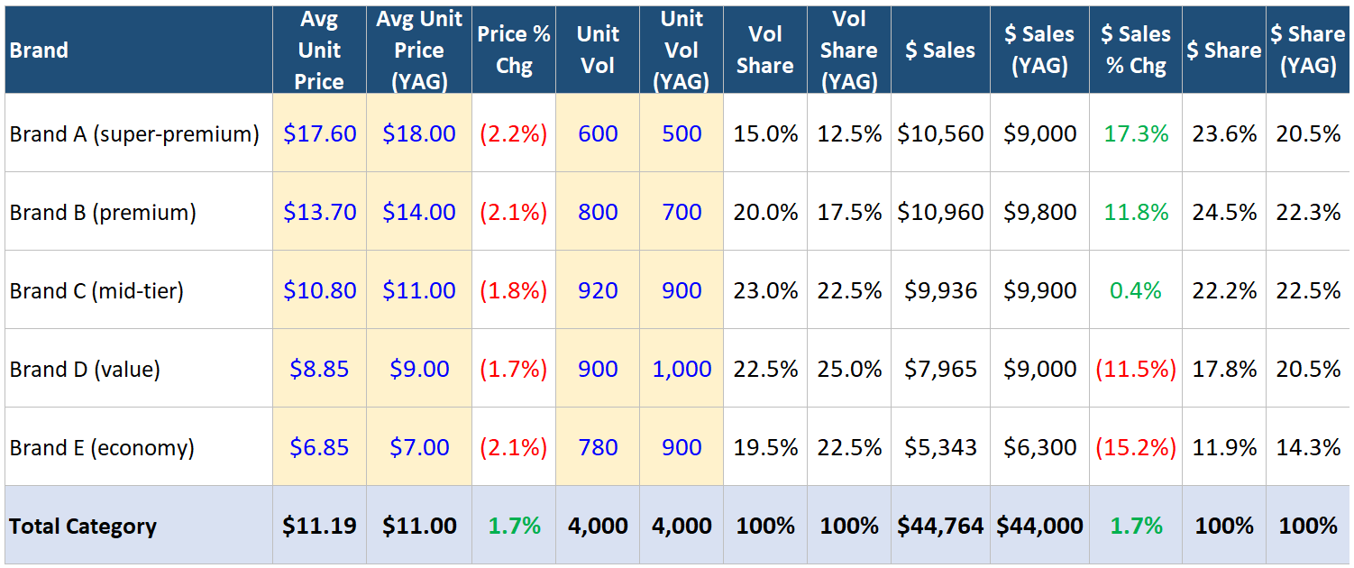
Let’s look at the price columns first… every single brand is down about 2%. Now look at the unit volume and volume share columns. Volume shifted toward the higher-priced premium brands — A and B together climbed from 30% of category volume to 35%, while the value end (D and E) gave back share. Because the category’s average price is just a volume-weighted blend of those brand prices, even that modest shift was enough to nudge the category average from $11.00 up to $11.19, even though not a single brand raised its price.
That’s the mix effect.
In other words, two things that looked contradictory were both true at the same time…and the data was right all along. It’s a great reminder that in CPG data, the aggregate number and the brand-level numbers can tell opposite stories. You have to understand the mix underneath to know which question you’re actually answering.
And here’s why this matters well beyond one client call…
All the time, analysts and executives will pull a simple data run of category-level price changes and take the number at face value. Picture a banking or policy team trying to read inflation at the category level. A standard POS dataset won’t separate true baseline price movement (i.e. the same SKU costing more or less than it did a year ago) from the mix effect we just walked through. Strip that distinction away and you can land on a conclusion that’s the exact opposite of reality. For example, flagging a category as inflationary when, SKU for SKU, everything on the shelf has actually gotten cheaper. This is why official inflation measurement teams go to such lengths to compare like with like, not just at the SKU for SKU level, but also at the store-location for store-location level since even the market universe being studied can be impacted by retailer market share shifts.
Put simply, without interrogating the dataset at depth, the headline number can point you precisely the wrong way.
Less premiumization, more K-shaping…
And there’s an even deeper layer the average can bury. A category price that’s up doesn’t just hide the mix, it can also mask a “K-shaped” market underneath. In our example, the top of the category is booming while the bottom falls out. Premium volume surges as some shoppers trade up, while the value tier craters as others get squeezed or priced out entirely. Two opposite stories, happening at the same time… and “category price up 2%” flattens them into one tidy figure that reads like healthy, across-the-board premiumization within the category. For anyone trying to gauge consumer health, that’s the difference between seeing a category trading up and seeing it quietly splitting in two halves… to the likely long-term detriment of overall category health and sustainability.
In other words, the underlying reality is the opposite of the headline. This is actually a deflationary category. SKU for SKU, prices are down across the board. It’s just wearing an inflationary disguise, with the mix effect doing all the work. And the behavior behind that shift is critical for decision-makers. Perhaps premium shoppers, seeing their favorites get cheaper, are buying even more premium, while value shoppers are buying fewer value items altogether. These two ends of the market pulling apart even as prices fall everywhere.
Mix isn’t just a price thing…
It’s worth zooming out a little, because mix isn’t unique to price, or to the category level. The mix effect can sneak into almost any metric — price, velocity, margin, a growth rate — at almost any level of aggregation, from SKU to brand to category to total store. Any time you roll up components with different characteristics into a single number, a shift in the mix can send that number in a direction that contradicts every piece underneath it. (By the way, this post provides a good refresher on unit of measurement differences which are key to understanding the below).
Velocity is a great example. Take unit velocity measured in UPSPW per SKU (units per store, per week, per SKU). Say your high-growth beverage brand is running a trade-up strategy… you’re broadening out from a 12oz single can into multi-pack formats like a 12-pack and steering shoppers toward them. And it’s working. Your single-can velocity is still growing, just a touch slower, and your multi-pack velocity is surging. Not a single SKU is actually declining. Yet a straight pull of units per store per week per SKU at the brand level shows velocity…. falling off a cliff. How?
Because a multi-pack is, by its nature, a low-velocity SKU. One stock-up purchase replaces a string of single-can trips, so a store might sell 50 singles in a week but only a handful of 12-packs… even though those 12-packs move far more liquid. As your assortment fills up with these inherently slower-turning stock-up SKUs, more and more of the brand’s assortment sits at that low velocity, and the per-SKU average sinks… even though every individual item is growing. The “collapse” is pure mix.
Here’s an example to illustrate…
A year ago, the brand was basically two SKUs (a 12oz single and a 6-pack). Over the year it broadened into larger 12- and 24-pack formats and steered shoppers toward them…
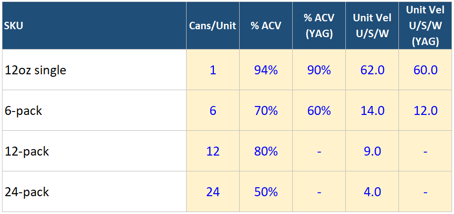
Notice how each returning SKU actually sped up its velocity or “turn,” and how the new bulk packs are selling. The larger pack size SKUs just turn far fewer units per store per week, because each one is a big, infrequent purchase.
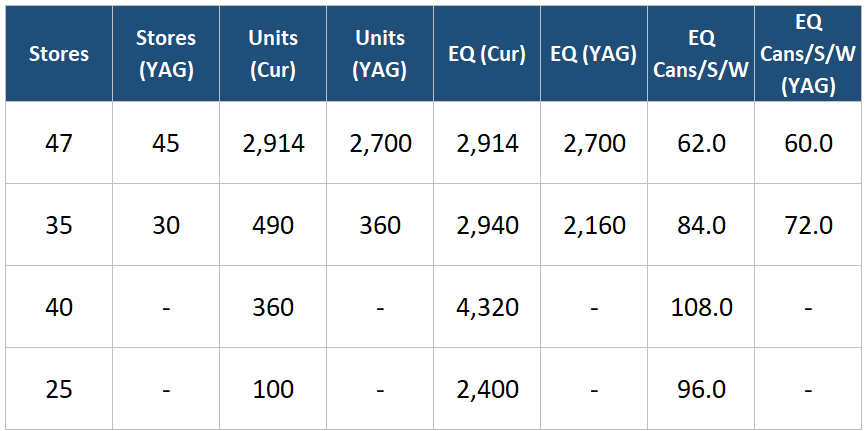
Now watch what that does to the brand-level reads…
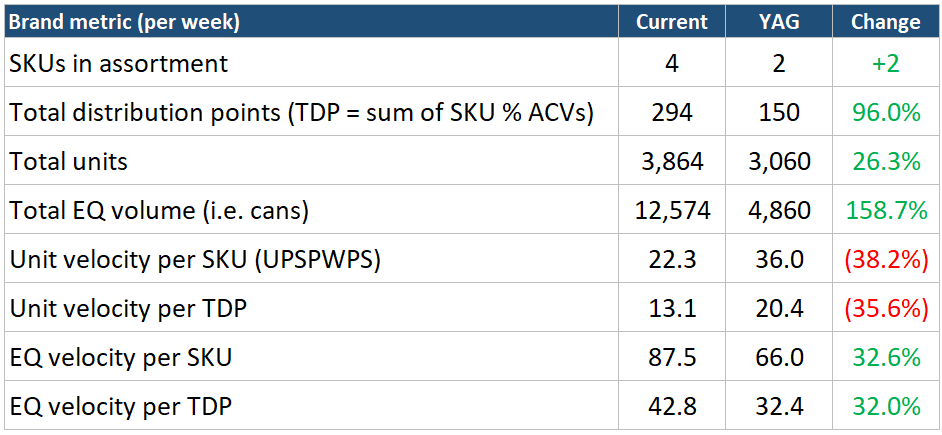
The two unit-velocity reads (per SKU and per TDP) both fall by nearly 40%. Pulled on their own, they scream “this brand is dying.” But equivalized volume is up 159% and EQ velocity is climbing on both denominators. The brand is moving far more liquid through far fewer, far larger transactions. In this case, unit velocity is really measuring the rapidly changing purchase mix within the brand ecosystem… which in this illustrative example is purely strategic and working as intended. So you can see how an analyst pulling a dataset of brands simple ranked by velocity and YOY velocity growth — depending on the velocity metric chosen — could miss a whole host of healthy high-growth brands executing profitable growth strategies.
In this example, consumers are buying more, not less. They’re buying more, in bulk, across fewer trips. Pull that per-SKU velocity number on its own, and someone important might conclude the brand is falling apart and start cutting the items driving its growth. Same data, opposite story. Which is the whole point.
These are the kinds of things I plan to dig into here.
Thanks for reading and subscribing.
Best,
Kevin Lehmann
Leave a Reply